

A CLOSER LOOK INTO THE ULTRAS CAPSULE

Launched in mid-December 2023, I've designed the Ultras capsule for hardcore Fortune Centre FC fans to pledge allegiance and affinity to the FCFC brand, embodied by our slogan 'Be Unreal'.
We’re a clothing brand disguised as a football club. We cant really say that we are a football club if we don’t actually have our own Ultras, can we?
Thus, I wanted hardcore FCFC fans to have access to this capsule that closely aligns with our brand principles and I truly wanted something we all can wear to whatever is our next party/football game/lepak sesh.
But... what in the hell are 'Ultras'?
WHAT IT IS ALL ABOUT
If you don’t already know, the terms Ultras originated in Italy to describe the football fanatics that display their unwavering support of their football teams week in week out every time AND everywhere they play.
Often confused with hooligans, the Ultras are the more I-dare-say “law-abiding” facet of passioned support — organised to lend their bodies and voices to the cause of their favoured football team. These are the hardcore fans that come for 'battle; with huge banners or ‘tifos’; an array of musical instruments to drum up atmosphere; and an assortment of get-up and flags/displays to let people know where their loyalties lie.
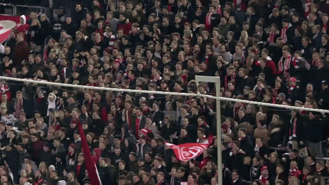
Of recent times, the term has become a common fixture in the footballing lexicon with swathes of football supporters in Europe organising and contributing to the matchday atmosphere in countries such as Germany, France and England.
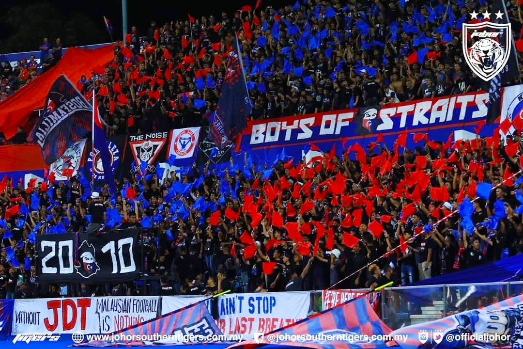
Much closer to home, the rise to prominence of the southern Malaysia club, JDT, has also led to the formation of their very own Ultras in the Boys of Straits who now also boast their own merch and anthems. Stemming from their success, club support from other participating Malaysian states have since followed suit and spawned their own Ultras support.
DESIGN DIVE
The Ultras capsule features 2 main design blocks; the Grunge and the Kretek — with both designs adorning a collection of apparel from heavyweight tees to turtleneck hoodies. There’s also a subsidiary 3rd design in Type featured on our midweight tees.
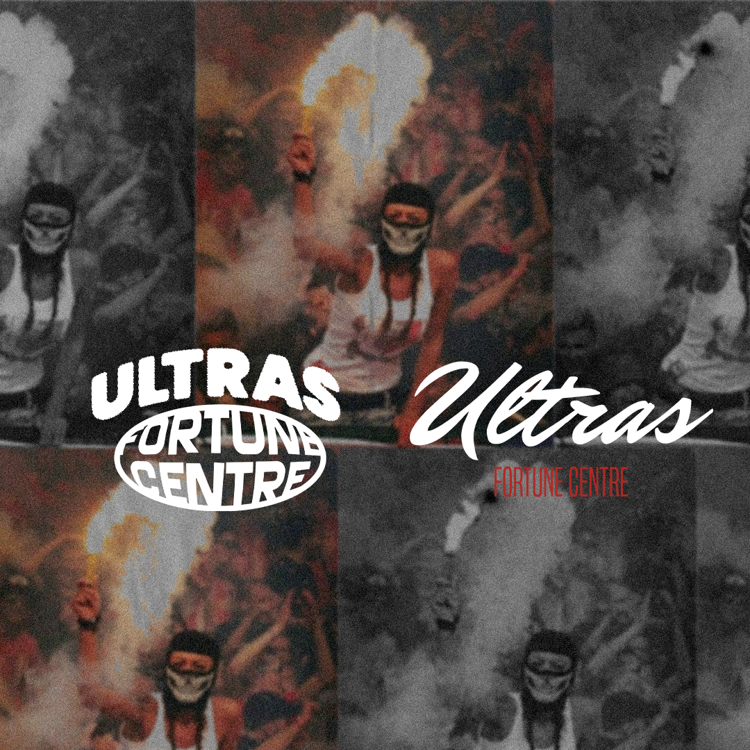
The inspiration behind the Grunge design lies in the oneness of support Ultras typically portray for their chosen football team; encapsulated by the ellipse that loops around our brand name ‘Fortune Centre’.

The Grunge design is further exemplified by the grunge textures used in the word Ultras that embody perhaps the haphazard nature of organising such a raucous group — but one that ultimately works out favourably for all parties involved. The masked, hooded supporter is one closely associated with being an Ultra; faceless yet distinguishable — an icon.

For the Kretek design pillar, I gotta admit — I had been watching one of Indonesia’s best films on Netflix, Gadis Kretek (Cigarette Girl), and was so inspired by the designs of clove cigarette packs shown in the film that I had to make it Ultras.

As such, the font used for the capsule name ‘Ultras’ is a hark back to the 90s where cigarette packs wanted a touch of modernity but at this current time; it’s nascent nostalgia. I also drew inspiration from real life cigarette brands design such as Sampoerna and developed the ‘U’ for Ultras in an Old English type font with a nature-themed backsplash.

The Ultras capsule is still available for purchase on our website and can be perused here!
1 comment
Insightful 👍🏼